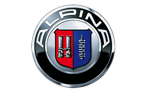
THE ALPINA EMBLEM
A red and blue emblem encircled by a black ring with ALPINA in large white letters: this logo has been making car enthusiasts hearts’ beat faster since 1967. A historic trademark with an interesting story behind its creation and evolution. Here you will learn how the ALPINA logo came about, what it stands for and how it has evolved over the years.
Fascination of the Alps
First, about the company name: Anyone approaching Buchloe, the home of ALPINA, from the North will understand how the choice of name makes complete sense. But it wasn’t ALPINA’s founder who was inspired by the picturesque views of the Allgäu Alps to come up with the company name, it was actually his mother: the story of ALPINA started on the site of the typewriter factory owned by the founder’s parents in Kaufbeuren in the Allgäu. Burkard Bovensiepen simply ‘borrowed’ the word mark of the ALPINA typewriter business for his newly founded company.
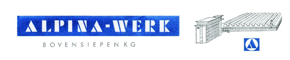
Burkard Bovensiepen used the letterhead and lettering of his father’s typewriter factory for his business correspondence until 1965.
With the establishment of Burkard Bovensiepen KG on 1st January 1965, ALPINA was kept as the trademark and new versions of the ALPINA lettering gradually came to be.
The 1960s and heraldry
The company and its product range grew – and with it Bovensiepen’s desire to have a logo to complement the lettering. He felt it should be round, a figurative mark reminiscent of the BMW logo. But Bovensiepen’s typical Bavarian design with white and blue diamonds didn’t go down well with his partner BMW, and no sooner had he presented it at the 1967 International Motor Show IAA that he was prohibited from using it.
But necessity is the mother of invention. The same year, Bovensiepen presented a new design. Interesting the ALPINA emblem was born at a time when there was no real interest in traditions in general and heraldry in particular. Then again, the young entrepreneur Bovensiepen was always good for a surprise!
1967: the first ALPINA emblem
Left: Dual carburettor
Right: Camshaft
1971
Left: Dual carburettor
Right: Crankshaft
In the beginning, the ALPINA emblem depicted a dual carburettor and a camshaft – the very engine components ALPINA focused on at the beginning of its business operations, since the name of the game was increasing the power of carburettor engines. In 1971, the emblem was redesigned again: the crankshaft replaced the camshaft. It symbolises engine capacity and torque.
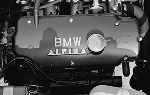
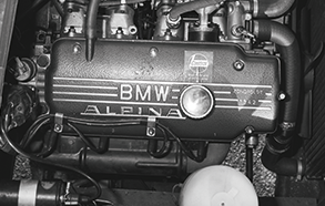
Single throttle and crankshaft: running smoothness and power output
Since 1974, the emblem has depicted a single throttle as the new ALPINA engines featured a modern throttle and injection system, replacing the dual carburettor. Thus the ALPINA emblem to this day embodies the central development goal of the ALPINA engineers: to make torque and superior running smoothness a reality for every new BMW ALPINA model through technical finesse.
Left: Single throttle
Right: Crankshaft
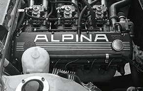
BMW ALPINA
Incidentally, you should be suspicious if you see an ALPINA emblem on the front or rear of a car. A genuine BMW ALPINA automobile would never deny its roots, and proudly bears the BMW emblem. The only places you will find the ALPINA emblem on the exterior are on genuine ALPINA wheel sets and in the engine compartment.